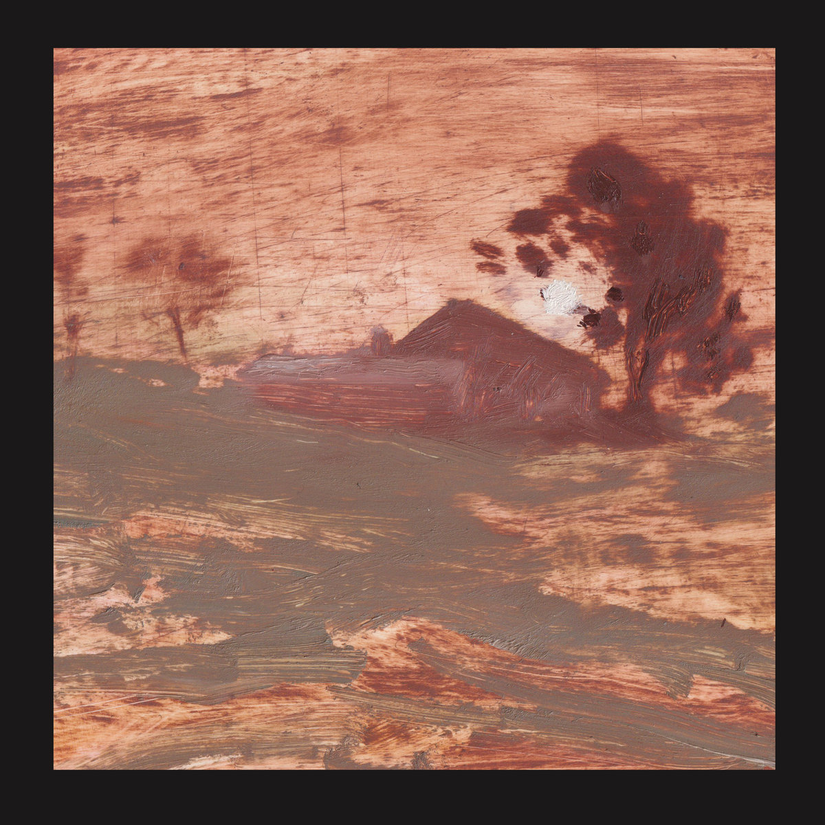
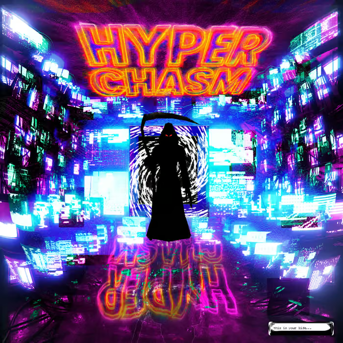
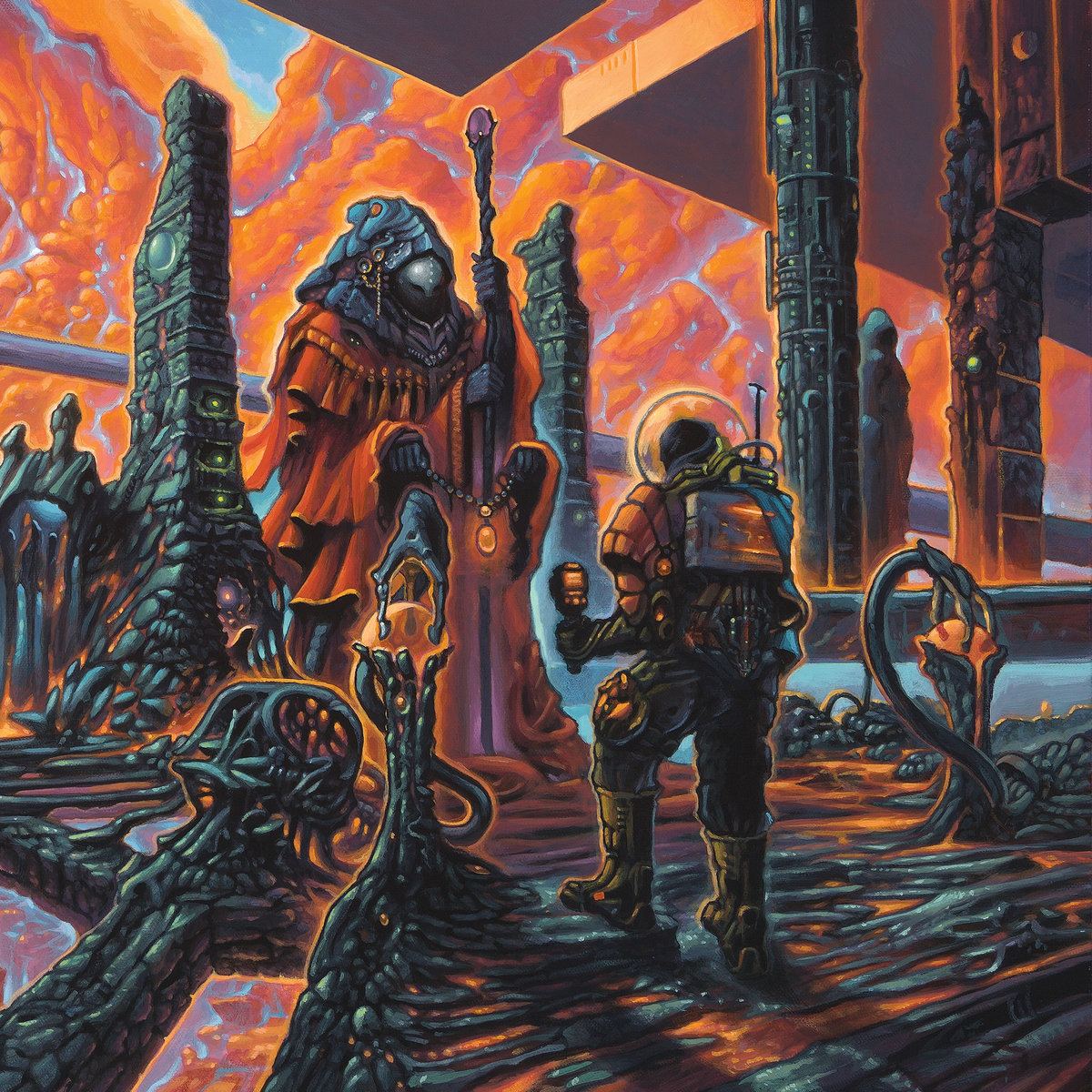
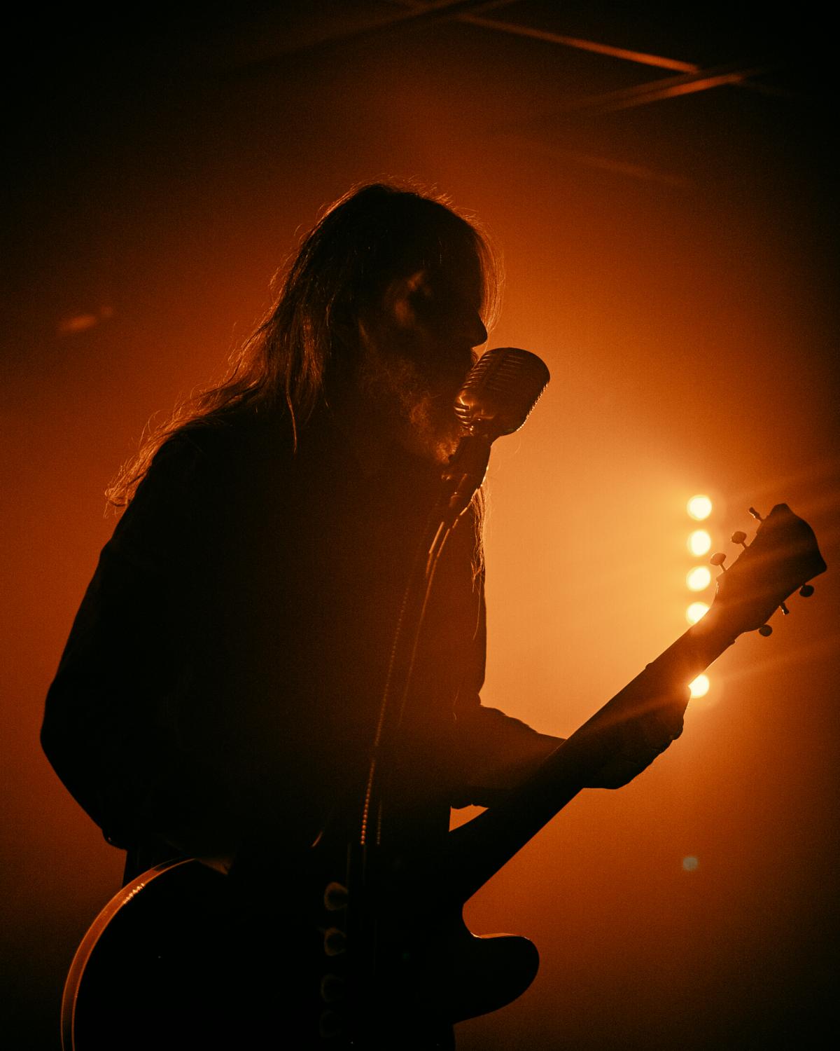
Concert posters. There are basically only two categories - those cheap run-of-the-mill ones on thin, non-tactile paper which you can buy outside the venue for a fiver and those nice, silky ones printed on thick paper and mostly silkscreened. Silkscreen. One of those magic words for every music lover. But how are those made? What is the process behind it all? We spoke to one of the masters of the silkscreen printing craft, the famous Lionel Arlen or, as more might know him, Le 7e Oeil.
The following interview will be a little bit different from our regular ones, as there is basically no music you could listen to. However, if you somehow must listen to we suggest you listen to A Storm Of Light’s Anthroscene record, Throane’s latest EP or Amenra’s De Doorn because these are bands that Lionel has worked with before. And now - let’s find out more about this amazing artist.
Lionel, everybody loves a good silkscreen poster because of their special look. But nobody has a good clue of how those are made. Can you in short explain the process of bringing the idea for a poster into form and then how such a piece of art is printed?
Not sure that the process of creation can really be put into words. Each creation is essentially the result of feelings and questions about the current project. Each project is an ordeal, the process is never simple, but there is a link with the desire to express through images a thought that one has. Also, this process varies depending on the subject or what you want to express. It can start from a photo that we rework, from a sketch that we detail, from an abstract idea that we translate into shapes.
Regarding printing, and in particular manual printing, the fragile and vulnerable aspect of screen printing also plays an important role in the design process. It is a medium allowing infinity of possibilities while imposing strong constraints. These technical constraints are an integral part of the design, from the first idea to the last gesture. In my opinion, it is essentially this vulnerable aspect that makes a silkscreen so interesting and so beautiful.
A lot of people do not know that – apart from your famous silkscreens – you are also involved in other projects as well. Can you give us like your three favorite projects you were involved in?
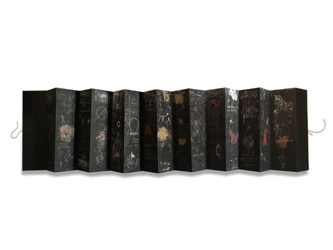
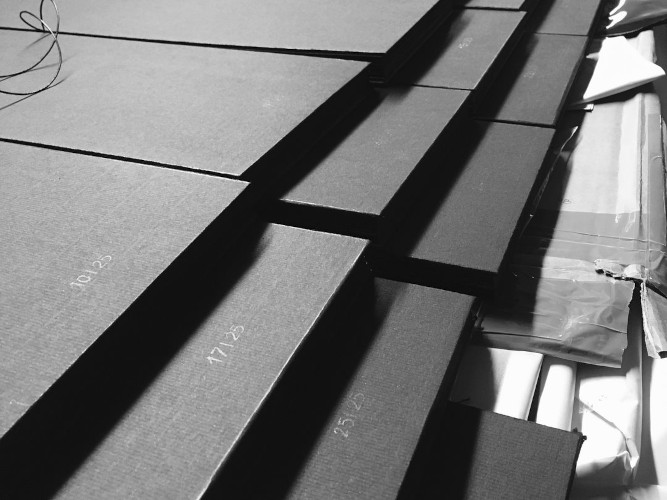
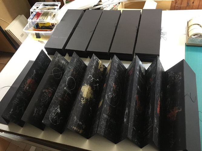
GAST BOUSCHET Poisson Oracle Limited edition of 25 extendable books Size 56x17cm | 15 double-sided pages | 3 colors | rugged hardcover 2.70m long unfolded .
Published with the support of Focuna, the National Cultural Fund, Luxembourg. The goal of this project was the serigraphic translation of 30 paintings by the artist Gast Bouschet. Each painting measured 2.70m x 56cm. We thus decided to create an accordion book compiling the reductions of each of its paintings so that the fully unfolded book retains the same original dimension. Thus the book measures 56x17cm closed and 270x56cm unfolded.
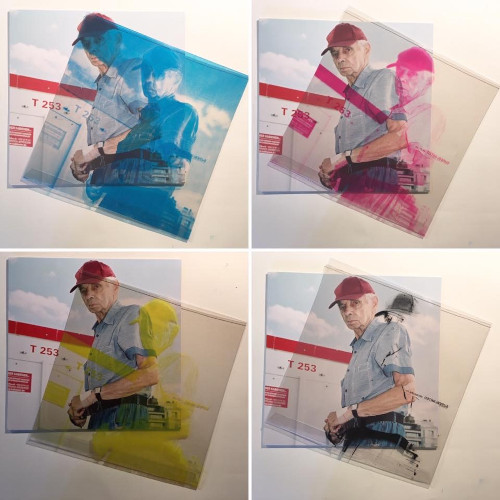
SUPERGENIUS Supertired The release of this album brought together two labels (9000 Records and Hypertension). They wanted a limited edition available in four different versions. After long hours of research, the simplest idea finally arrived: to realize the dichotomy in 4 CMYK colors of the original cover on a transparent PVC slipcase. So one version would be the Black layer, another the Cyan layer, the third the Majenta layer and the last the Yellow layer. In the end, if we superimpose the four slipcases on top of each other, we find the original cover.
YANN BLACK Diptych Yann is an artist whom I have always appreciated both for his tatoo work and his paintings. I was fortunate enough to meet him a few years ago for a tattoo we did, between Nantes, Paris and Montreal, and so also the opportunity to see each other several times. It was a real honor to work on one of his paintings; a diptych screenprinted in 4 colors on a beautiful BFK Rives paper.
What drew you to the arts? And when did you notice that are so good at it that you can make a living from it?
As far back as I can remember, graphic art, and in particular the album covers that marked my childhood, have always had a big impact. I remember spending long hours as a child looking and analyzing every record cover in great detail and trying to reproduce it on cassette or CD covers. Pretty soon I started making album art for my friends’ bands from high school and college.
Studies in architecture allowed me to continue to develop artistic and technical learning. For the screen printing, it must be admitted that it was a bit of a hazardous and happy coincidence : With a band from the region we had the idea of making a handcrafted LP cover in screen printing, with the help of a screen printer friend. This one not having the time necessary to finalize all the copies, simply said to me: “you seem to like it, I lend you two hinges, a screen and some ink, you will finish with you…. ”, a challenge, a precarious installation “à la punk ” and a few printing tests convinced me… the adventure began.
You told me that you also sometimes draw the images for the silkscreens yourself – where do you get the inspiration from?
In my opinion, musical and visual works have so much more to say than just words. From a young age, I have never been comfortable with speaking. The visual has always allowed me to express my feelings more effectively. I think that an emotion, a feeling will always be more easily described by sounds or graphics than by long sentences filled with language filters. Right now my inspiration comes mainly from various encounters over time, from everything around me. I try as much as possible to keep an open eye on the surrounding world, on the creations of current artists, but always making sure to keep a sufficient distance so that a work that I like does not become a reference to which I do not. will be able to detach myself more.
Is it true that you use each of your silkscreen “models” for a pillow?
No, not all the projects ;) Only those which have been made on flexible supports (fabrics, leather, even once in plastic for Cocaine Piss) and which can therefore be sewn and turned into a pillow. I like to hijack objects.
The first pillow was made a bit like a joke with Colin H Van Eeckout for his album Rasa. During the release party, I brought him all the pockets I had made in fabrics so that a friend of his could close them once the vinyl was placed inside (poor fans who have had to unstitch the upper part to be able to listen to the record;) Meanwhile, while we placed each vinyl in a fabric sleeve, Colin said to me “hold on, it’s funny it looks a bit like a cushion, I could take a nap on it”. That phrase stuck in my memory and when I got back to the workshop I just picked up some of the pounches I had left, stuffed them, and sent Colin some pillows.
A sort of “tradition” has been set up since: for each vinyl pouch made with flexible materials, a limited series of pouches is hijacked to create … pillows, giving a new dimension to the object.
Is there anything that could not be used for silkscreening? Is hard paper the material it works best on?
Screen printing can be done on any type of material, from paper to glass, including plastic, wood, metal, etc., provided that the ink is adapted to the support in question, and this is one of the peculiarities for which I like this way of printing. On the other hand, there remains the constraint of flatness of the support, it cannot include significant reliefs, unless it is possible in this case to adapt its screen. So, yes, paper or cardboard is a perfect material, but I still find so motivating to try on every and each material possible.
Do you prefer projects with clear-cut commissions or with creative freedom?
A clear order is faster to make because there are fewer questions to ask. On the other hand, there is always a part of “translation” to be carried out in order to adapt the design according to the constraints linked to screen printing.
An order with complete freedom of design will be richer on a creative and personal level. I believe that there is no truth between the two, and it really depends on the project in question and probably also a little on the mood of the moment ;).
How must we envision your daily life?
Children - work/music/work – children - work
A few weeks ago I spoke to another famous artist who said that he basically works everyday to make it pay. Is that the same with you?
It’s quite fair. Practice remains the only way forward in my opinion. Personally, I work six or even seven days a week (haha), and when I’m not in my workshop, the brain continues to work in the background. But I remain aware that I have a huge chance to be able to work on a passion that fascinates me.
How many projects do you usually do a year?
So far it has been around 15 projects per year, or a bit more than one project per month on average. This also due to the fact that since 2020 I had a daily job in architecture beside the sudio.
The year 2021 has been a lot busier, and should count around 25/30 projects at the end of December.
Do you think there is a certain “Arlen”-style?
I don’t think I have a style defined or definable in words. . I’m trying not to lock myself into something. I like the sobriety and a certain romanticism, but mostly the dark character of romanticism.
There are some bands that you work very closely with, do these collaborations come via the labels or with the bands themselves?
Again this is very variable. Lots of projects come from labels. Then, sometimes, the bands come back directly to ask me for new projects without going through the label. At other times, it may be from a group you met at a festival or concert. Some projects are also the result of contact that I do directly with groups. I regularly contact certain groups directly to offer them a collaboration.
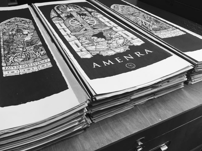
You have worked with some very famous bands like Amenra, Blut auf Nord, Latitudes, Lento, Throane or Ulcerate. Of course I do not want to know which band you like best – but how often do you have to re-do a design?
The frequency of work with groups depends on their topicality. At the start of the creative process, we exchange a lot of ideas and desires. Then it’s a back and forth game, preparatory sketches before reaching a final design.
Most of the bands that I associate you with are more from the darker side of music, often very contemplative and introvert. Is that also the kind of music you listen to?
Absolutely. I listen to a lot of different things depending on my mood at the moment, but I have to admit that the darker side of music is the one that attracts and inspires me the most.
Do you listen to the bands when creating something for them? Do you look for points to elaborate on your posters, for example?
Yes always. It is very important for me to be able to immerse myself in the music and the universe of a band I work for. For me, the visual aspect is inseparable from the audio aspect. There is a feeling of understanding seeing the complete packaging. Having a tangible experience, both auditory and visual, is important to me. On the other hand, during the final production phase, I almost forbid myself to listen to the album I’m working for, a kind of superstition.
How was it possible to develop such a distinctive voice in connection to the two labels you work closest with Debemur Morti and Consouling Sounds? Did you first sit down with both labels and came up with like “a style guide” for example?
It all came about quite naturally. Many years ago now, I just sent a few emails to different labels that I regularly ordered LPs from, including Débemur Morti and Consouling Sounds. It was probably more “a bottle thrown into the sea” without really believing it. The latter two responded quickly, showing their great interest. Since then, we have been regularly discussing new projects, either by email or by phone. Usually, some sort of back and forth between us is enough to come up with the idea of what the project is going to be.
Are you by now further involved in one of these labels?
This is variable depending on the frequency of label releases. DMP is very active and we work together very regularly, therefore, yes I am more involved in terms of volume with DMP. Also, together with Phil we really enjoy working as a triptch DMP-DEHN SORA-LE 7e OEIL. A proven recipe that works.
Do you immediately come up with ideas for these labels?
Usually the idea comes fairly quickly, but as with any creative process there is always a more or less long phase of questioning or even anguish not to find the Idea with a capital “I”. During the time we’ve been working together, I think a kind of mental connection has developed over time and with plans. This has the advantage of knowing very quickly if we are on the same wavelength and if the choices made are the right ones.
How important is the spirit of your customers for you? Their music?
Yes, with every request from a group or from labels, I have this need to hang on to the music, to their universe. It would be difficult for me to conceive / make something based on a musical universe that I don’t appreciate. It seems to me that the artistic connection remains essential in any design. For me, image and sound go together, the visual is just as important as the music in the expression of an album, in the overall sense
Are there (groups of) people you will not work for?
Absolutely. I have a number of values that I wouldn’t want to deviate from. If a group’s universe or their ideas go against these values I will refuse to work with them. This happened to me a short time ago. The project seemed interesting when I first contacted the label that contacted me. However after several searches on the group in question (which I did not know before the label contacted me), I was able to discover that their ideology went completely against mine. I therefore put an immediate end to any possible collaboration.
Now – which artist(s) would you still like to work for someday?
Difficult to answer this question, given the number of artists with whom I would like to collaborate. I will give you these two:
- Godspeed You! Black Emperor because a project had to be done for their coming to Roadburn in 2018, but could not come to fruition in the end. I am still now disappointed that this did not happen.
- Aaron B Turner, because I really enjoy all of his musical work.
… and many more;)
What are the three pieces of art you are most proud of?
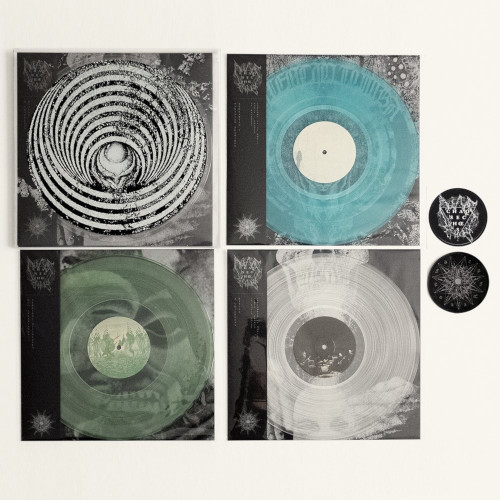
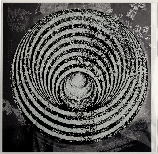
CHAOS ECHOES The Occvrvs Series.
A PVC box containing the reissues of Parisian Sessions / Rehearsal I, Duo Experience / Spectral Affinities & A Voiceless Ritual. Printing on PVC is delicate but offers a fabulous set of transparencies. On this project, I had the chance to work with Stefan Thanneur. This resulted in a magnificent object, with dense graphics and yet completely readable at the same time.
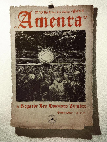
AMENRA Le Divan du monde 2015 This is a project that is particularly close to my heart because it kind of sealed a rich collaboration with Amenra and also because these posters were made 100% by hand, including the paper which is a homemade paper. The visual was defined by the group, and Colin wanted to add a tactile and old character to the poster. I then offered to make the paper with the scraps of paper from our previous collaboration. Admittedly, the production of the paper was much longer and more laborious than the printing itself (ahahaha), but this allowed the iconic tripod to be embossed directly into the thickness of the paper while it was drying.
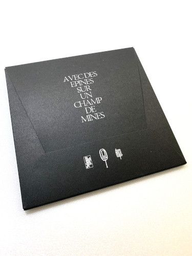
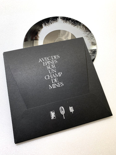
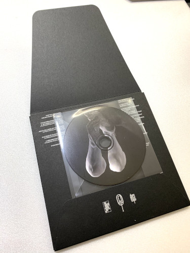
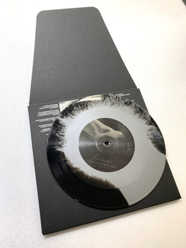
THROANE Avec des Epines sur un Champs de Mines I’ve always enjoyed working with Dehn Sora on the many projects we’ve done together. When the idea came up to make a vinyl and CD case of his new EP, I jumped at the opportunity of creating a sober but nice boxset.
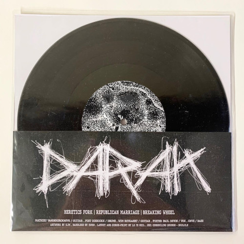
DARAK … just because the band logo has been designed by my yougest son ;)
Do you also teach your art to others? If so, how must we imagine Professeur Arlen?
I rarely taught. Not out of want, but rather out of a lack of opportunity. Maybe these opportunities will present themselves in the future. Good question to which I cannot answer frankly. I imagine being a calm and caring teacher, but probably too little patient (that’s what my kids tell me anyway);)
Last question before our quickfire round: Can you explain the name of your workshop – Le Septieme Oeil?
Initially, “Le 7e Oeil” was a video design collective, formed by a friend and me. We made some video clips for different bands. The origin of the name comes from the mix between the 3rd Eye (the eye of the soul) and the 7th Art (cinema) which I think remains present in any graphic design, even frozen, non-animated. The adventure did not continue for various personal reasons.
Subsequently, I signed several graphic designs under this name, and decided to keep it. At the same time, the number 7 is a number that has always followed me, and to which I attach particular importance for its sacred symbolism.
Quickfire questions:
Mayhem or Bathory? Bathory
Panopticon or In The Absence of Truth? Panopticon
Alsace or Paris? Alsace
Football or Rugby? Rubgy
Beer or Wine? It depends on the mood and the time. My wife is Flemish, I am French, I believe that we cannot part with beer or wine;)
Hummus and Couscous or Boeuf Bourgignon? Boeuf bourguignon (especially since I’ve always been told that the one I prepare is delicious … ahahaha)
Vacation, work’n’travel or staycation? Work’n’travel for sure
Drone Metal or Ambient? Drone
Doom or Folk? Doom
Streaming or Analogue? Analog if I can find the time to sit comfortably and listen carefully. Usually streaming during the day while working; this allows you to let the sounds flow together freely while remaining focused on what you are doing, and sometimes brings some nice surprises.
Lionel, thank you for your time, we wish you all the best, many more amazing projects and a good Christmas season!
Thank you Thorsten and VoS!
Make sure to check out Lionel’s amazing work at le7eoil.bigcartel.com or follow his Facebook account to see more of his art.